Choosing the best font for your stationery can be one of the toughest decisions. I have created a list of my top 40 most popular fonts but I do have access to lots more .. so if you’ve seen a particular font you’d like to use please let me know and I’ll try and get it for you.
Here is a link to my top 20 Font Styles: Font Style Sheet
Feel free to download this and choose your font style in your own time. Most of the designs shown on my website will use these font styles but sometimes I might sneak in a different one depending on the style of the invitation or just for a bit of a change! If you have a specific font in mind then let me know and I will do my best to get it for you (a small charge will apply for recreating templates a different font for you).
Be careful with Script style Fonts
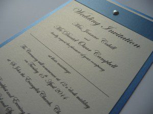
I s uggest not using a script style font for all of your wording because they are often hard to read. Please see here an example of an invitation where all of the wording was prepared in a script front called “Edwardian Script”. It did try and advise against it but I don’t always win the argument!
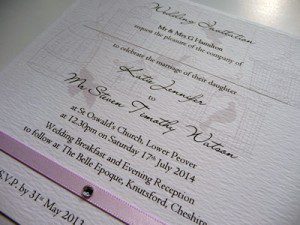
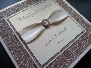
Instead, script fonts work really well for your names and headings on your invitations. I would always recommend using a plainer font for the main text and information parts of your stationery. Things like numbers and postcodes get really difficult to read if they’re in a script style font.
Traditional or Contemporary
The Font style you decide on can have a big impact on your invitations. You need to consider whether you’re looking for something traditional or something more contemporary. Your invitations (or Save the Dates) are the first thing that your guests see and receive so you need to consider the font choices carefully so as you’re giving the right impression from the outset.
Traditional script style fonts include “Edwardian Script” and “Kunstler Script”.
Contemporary script fonts include “Lainie Day Script” and “Bickley Script”.
What about more simple?
If you don’t like the idea of script fonts at all then there are plenty of stunning, more simple, fonts to choose from too. These include “Trajan Pro” and “Century Gothic”.
Something different?
Often with “mummy and daddy are getting married …” themed invites I will use a more relaxed, fun style font.
More quirky style fonts including “Penelope Anne” and “Voyage”.
Incorporating Colour
In terms of the colour of your wording I try and stick to either Black, Grey or Brown. Sometimes I may incorporate occasional colours like pink or green but I tend not to overdo the different colours. Please see below for some ideas:
Once you have chosen the font style for your Save the Dates and Invitations then I will use the same one on all of your matching day stationery like Table Plans, Table Names and Placecards etc.
If you need any further help with your font selection or if you’re unsure which font to choose then please contact me.
For help with the actual wording inside your invitations please click here to read my other article.
If you’d like to see more examples, why not visit my pocketfold designs:
I hope you found this blog post interesting.
Please feel free to get in touch if you’d like any more assistance or advice.


